How to screenshot an Excel dashboard
By Celtrim · Updated
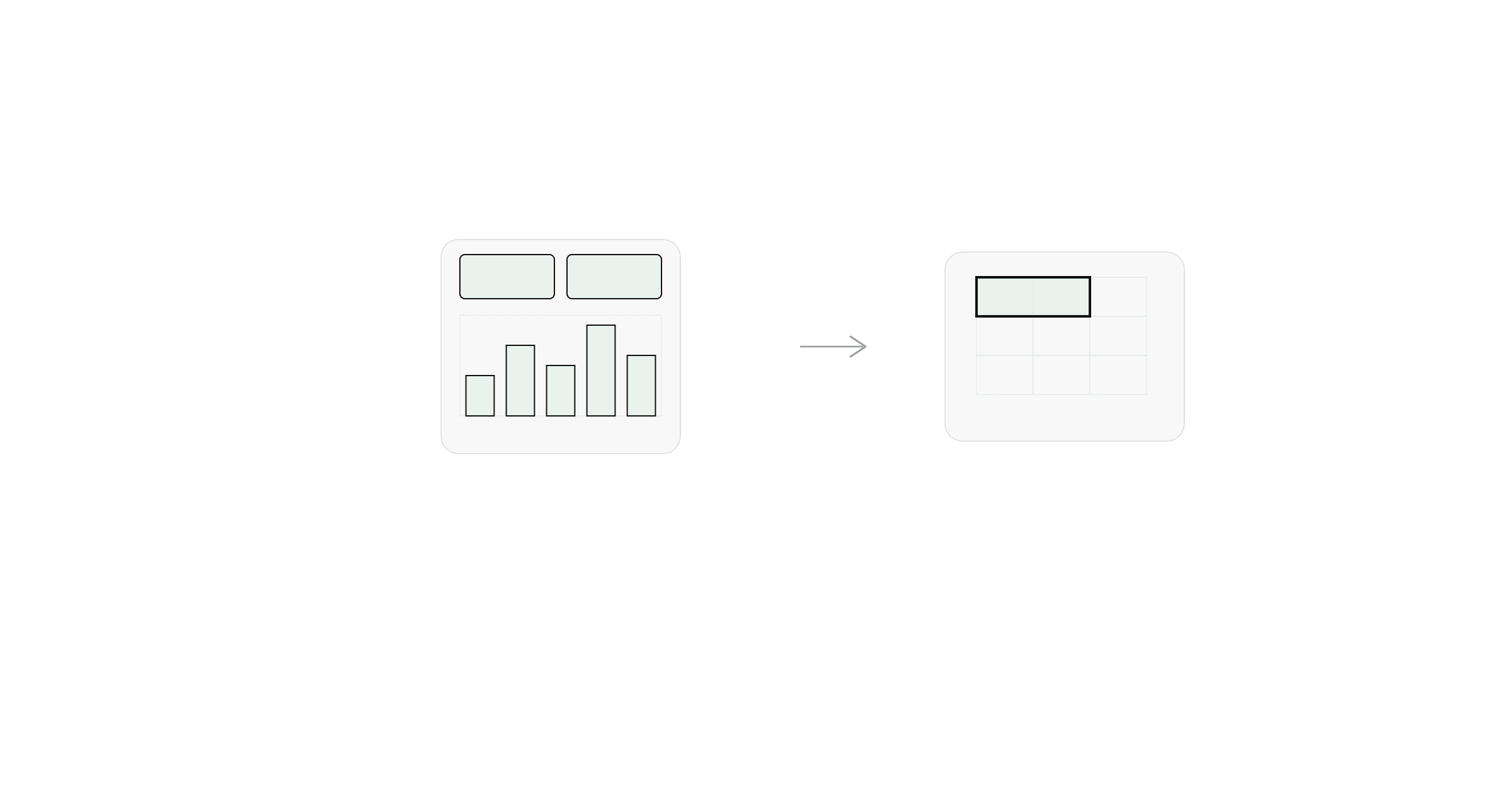
A dashboard sheet mixes two very different kinds of content: number cells (a KPI, a total, a percent-change figure) and rendered visuals (charts, sparklines, conditional-formatting heatmaps). They need different approaches, and treating them the same way is why dashboard screenshots so often come out inconsistent — sharp text next to a blurry chart, or a heatmap that loses its color scale entirely.
The KPI cells: still just data
The number cards on a dashboard — total revenue, headcount, this quarter's change — are ordinary cells underneath, usually just styled with a larger font, a background fill, and maybe a border to look like a card. Nothing about them requires special handling: select the range and export it, the same as any other worksheet data. This is the part of a dashboard that behaves exactly like a regular table screenshot.
Charts: rendered, not read
A chart object isn't cell data — it's a rendered image Excel draws from the underlying numbers, redrawn at whatever size the chart is currently sized to. That means:
- Resizing changes rendering quality. A chart stretched larger than its original size doesn't just scale up cleanly; text labels can end up cramped or oversized depending on how Excel recalculates the layout at the new dimensions.
- There's no "reading the values" shortcut. Unlike a formula cell, a chart doesn't have a single displayed value to extract — it's a plot of a whole series. Any tool that works by reading calculated cell values (including Celtrim) can screenshot the numbers behind the chart, but not the chart image itself.
For chart objects specifically, right-click → Save as Picture (or copy → paste as picture into an image editor) gives the cleanest export, since it renders directly from Excel's chart engine rather than capturing whatever's on screen at your current zoom level.
Conditional formatting: color that depends on state
Heatmap-style conditional formatting (color scales, data bars, icon sets) is visually part of the cell but computed live from the current data — the color you see is a function of the whole range at the moment you look at it. A plain data export (values only, no formatting) drops the color scale entirely, which defeats the point if the color is the information, like a status heatmap where the number matters less than whether it's red or green.
If the color scale matters, you need a screenshot that preserves the rendered fill, not just the numbers — either an OS screenshot of that region, or an export tool that captures cell background colors as part of the image rather than stripping them.
Putting a dashboard screenshot together
Most real dashboard screenshots end up as a composite: export the KPI number cells cleanly (values plus their background colors, since those often carry meaning too), save chart objects separately as pictures, and — if you're assembling a single image for a report — lay them out together in whatever tool you're building the final document in. There typically isn't a single clean way to capture "the whole dashboard" in one step once charts are involved, which is the tradeoff of a dashboard sheet versus a plain data table.